


Design Tips for Better Presentations pt 2 🤩👏2️⃣
Expert Design Tips for Non-Design Based Creators 🧑💻 Part 2 of advice on creating better looking presentations 🖥️

Amazing for non-design based presenters to enhance their visual storytelling with better slide design skills.
Boost Your Presentation Skills: Elevate your slides with these essential design strategies, whether you're using Keynote, Canva, or PowerPoint. This is part 2 of tips on how to create professional, engaging presentations that captivate your audience and effectively communicate your message. 🤩

Here are 3 MORE NEW key areas you can improve to make your presentations look more polished and professional 🔑 PLUS examples:
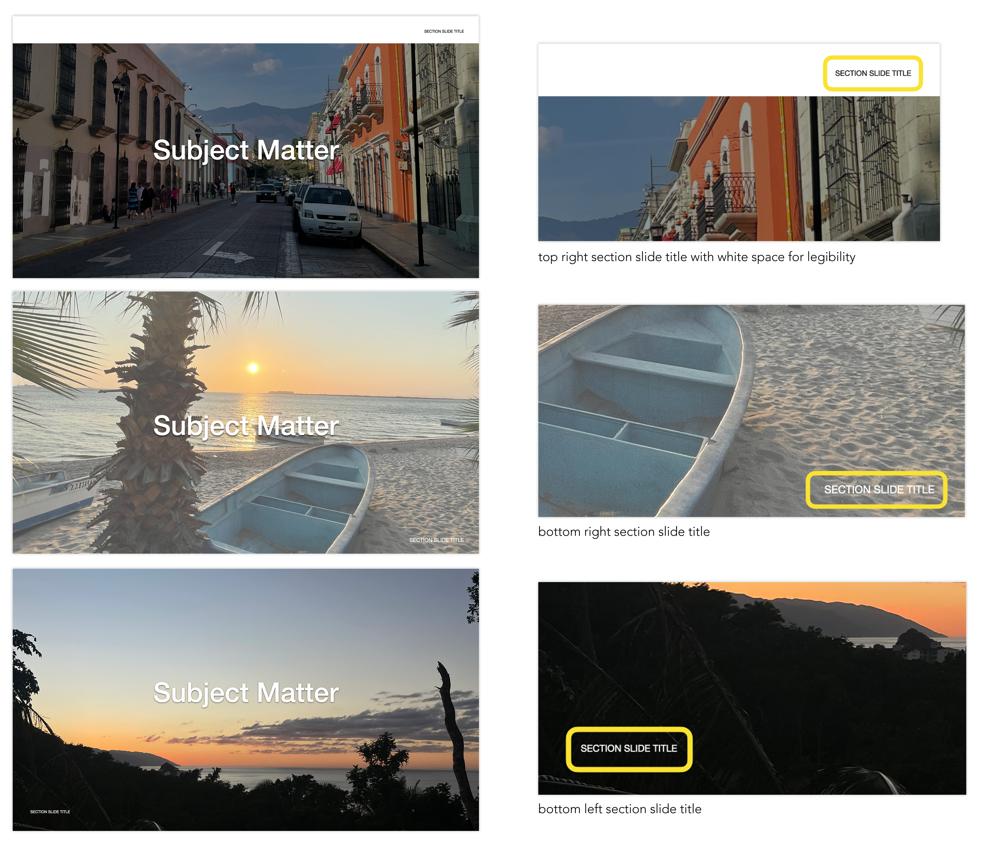
🗂️ Section Details
Section Slide Titles: break up your presentation with section titles; this helps break up the information and give people a chance to digest information.
Slide Tags: choose a place on the slide to display the section name in tiny font. This makes your slides look more put together and feel more organized.
🖼️ Photo Stylings
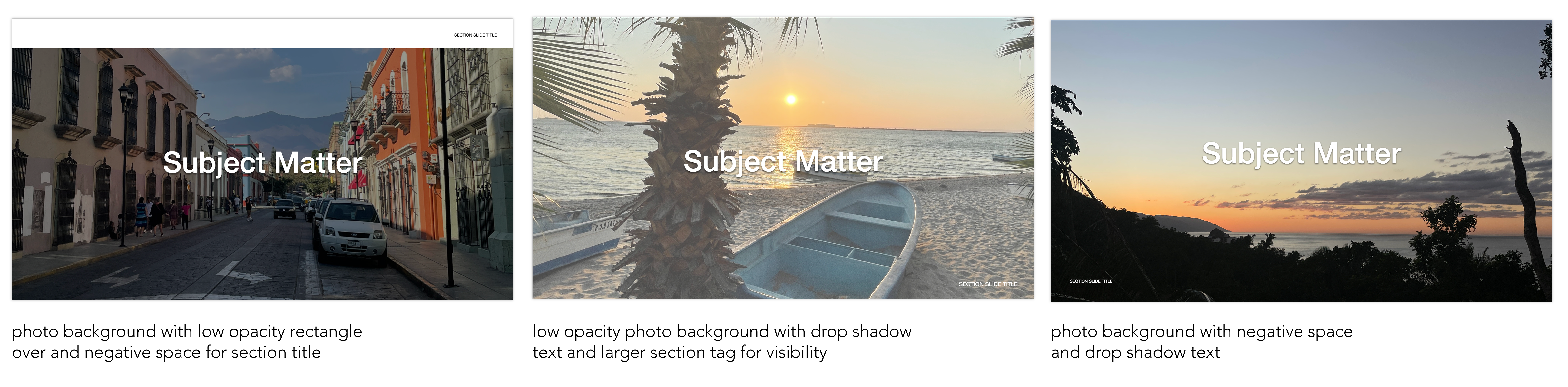
Aesthetic Slide Breaks: Create a dynamic section slide title by using a photo as a main feature. To make sure everyone can read it, be sure to add a drop shadow to the text or move the photo away from the text.
Opacity Changes: If you want to create a full-slide photo, consider lowering the opacity of the photo so that the text can stand out more.
⬜️ Negative Space
Balance: if your slide is feeling a little off balance, consider adding in some negative space (aka a section of the slide with nothing on it). This can give your information room to sit without being overwhelming, and help create natural breaks within your talking for questions or break times.
Room to Think: negative space gives watchers room to think without having to constantly be intaking information. This can help make your information easier to understand by giving people room to think about something before they’re given the next part of the information.
More Slides: sometimes using negative space can mean you’re using more slides, but that’s okay (unless you have a limit). Giving people a lot of information over multiple slides is easier than trying to put all the information into one slide—or you trying to explain everything at once.
By updating these small elements, you can make your presentation look more intentional, uniform, and polished. ✨ If you plan to work with a freelance designer but have a limited budget, implementing these changes in advance is helpful. It allows the designer to focus more on intricate details, maximizing the value of your investment. 🤑
💌 Thank you for allowing theBlogStack to guide your brand 💌
Design Tips for Better Presentations 🤩👏

Perfect for frequent presenters looking to enhance their visual storytelling and slide design skills.
Marketing Materials: 3 Ways to Create Consistent Graphics 🙌

Creating consistent graphics can be hard when you’re in a hurry! 😅 You have a million and two things to do, and creating a graphic just got added to that list. You know you have visual standards—but how are you supposed to add a perfectly on brand design to your list of to-dos?!
3 Prompts for Getting to Know Your Brand 🧐

People come to social media to get to know your brand. They want to know about who you are, where you source things from, possibly who your team is, where you’re located, and they’re looking on social media to find it. 🧐
very cool tips