3 Ways to Make Your Graphics Look More Interesting 🖼️
Your guide to graphics that wow and delight audiences! 🤩

Having trouble creating the graphic you’ve been dreaming about? You’ve moved elements around, but it’s just not coming together.. Try these 3 things to make your audience go “wow 🤩” when they see your content:
✂️ Layering & Cut-Outs
If the image isn’t looking quite right, or you just need a little more try layering differently—or cutting out elements to use (or repeat) on the page. This can add some detail and visual interest! You can also extend your photo more and layer it with your text, but keep in mind it’s important for the message to be legible over the photo (see tip 3 below!).

🔍 Accent Text
Big Text, Little Text, Red Text, Blue Text. Consider varying the text sizes and colors, as well as using oversized, or small text to create texture and balance where it’s needed. Make sure necessary information is legible on the intended device(s) it will be viewed on.

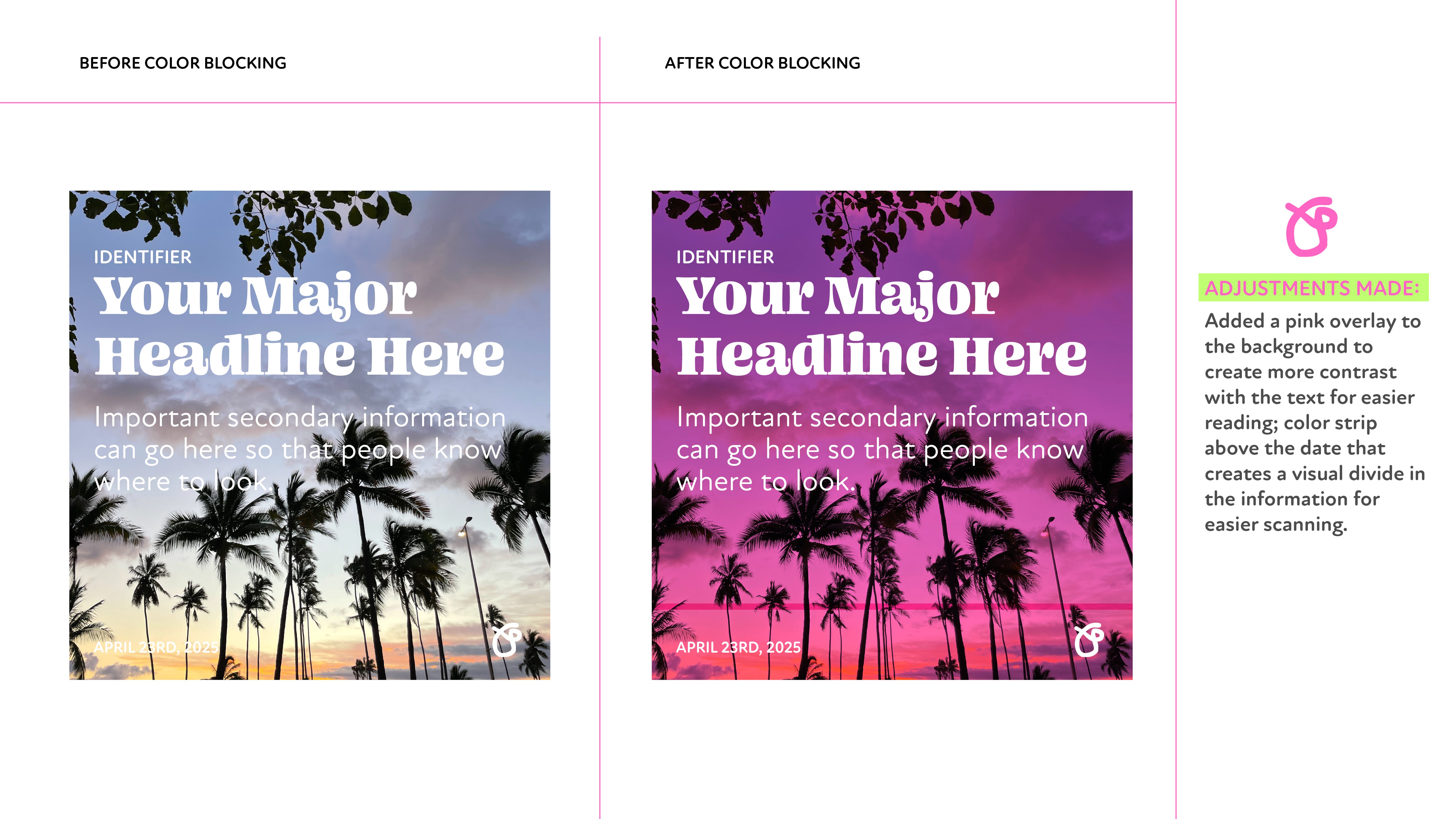
🟡 Color Blocking
Looking for a way to create a more branded aesthetic? Add color blocks into your design. Whether they’re small details that emphasize a word, or big background shapes that create a more interesting layout color blocking elevates your design by adding visual interest that moves the eye around the page, and can make for easier reading if you need to add contrast.