Design Tips for Better Presentations pt 3 🤩👏3️⃣
Part 3 on creating better looking presentations for Non-Design Based Creators 🧑💻🖥️3️⃣

Tips from a designer for non-design based presenters and solopreneurs to enhance their visual storytelling with better slide designs.
Create a following that keeps you booked and busy! Create better presentations. PART 3 of tips from a designer that help you create professional, engaging presentations. Captivate your audience and effectively communicate your message with our “Design Tips for Better Presentations” series. 🤩


Here are 2 NEW key areas you can improve to make your presentations look more polished and professional 🔑 PLUS examples:
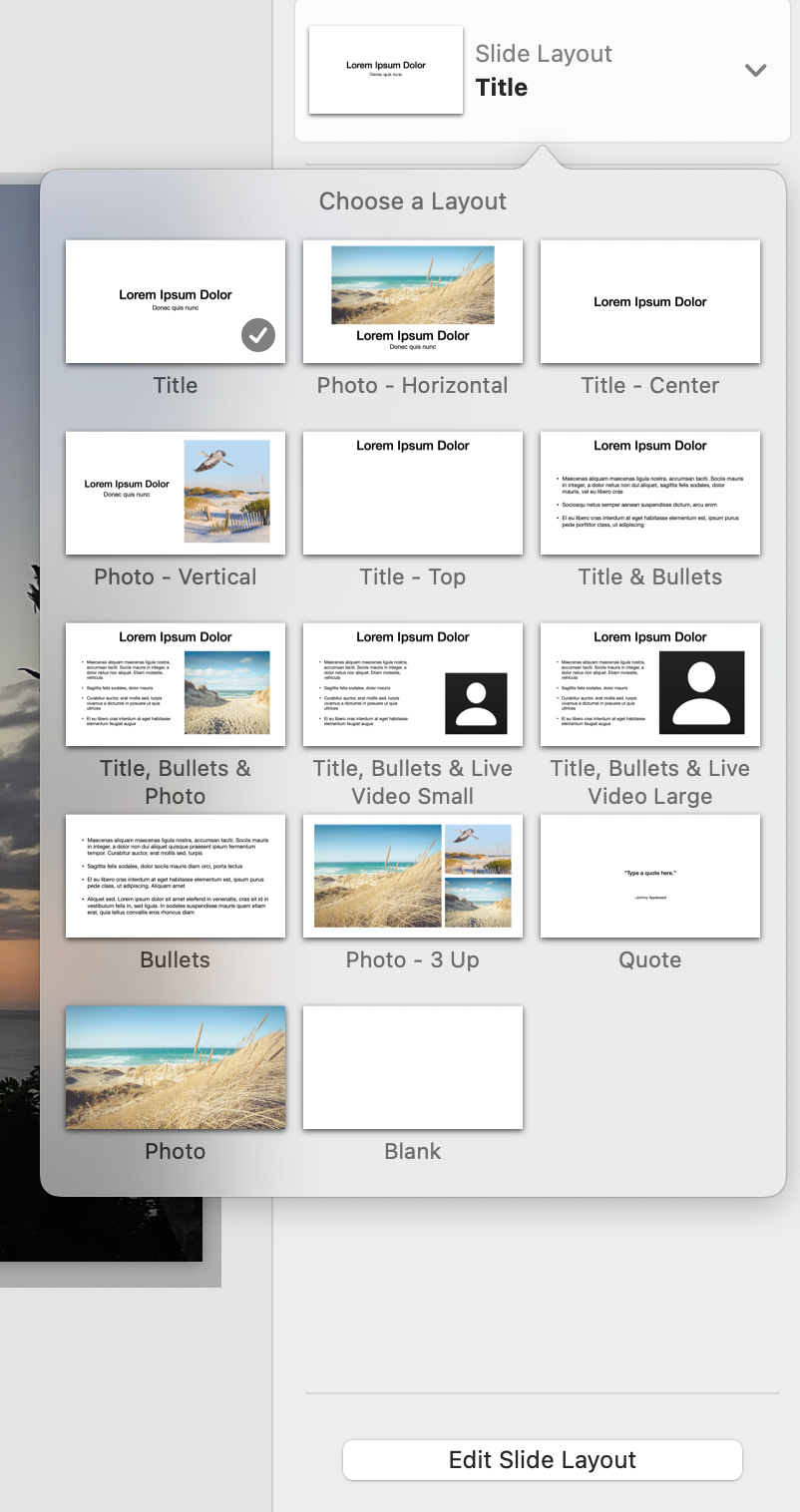
📋 Master Slides (and for PPT people)
Adding branding to your presentation slides will elevate it, but adding the logo and website, or more, to every slide can be really time consuming…. Until you discover master slides! This can help take your presentation design time down by a lot, or elevate your slide designs in general.
Simply assign, design and apply master slides to have slides set up like a template, when you go into fill-in slide specific information.
Use master slides to add:
📋 Logos, website and/or other brand details that appear on every slide
📋 Placeholder section details
📋 Placeholder text that can be edited on a slide-by-slide basis ensuring consistent text sizes
You can edit individual slides design without editing the master, making it easier than ever to add those little details that help a presentation look more professional.
📸 Photo Placements
Using consistent photo placements throughout can help cut down on distractions and streamline your message. Consider having a few different layouts, with photos taking up different amounts of space (as seen in the 4 examples below).

This will help you streamline your presentation visuals, and adding variety will pique the interest of viewers.
Check out our other photo tips.